Kill Brushed Metal, Kill Brushed Metal
Some people really like the Brushed Metal UI of recent Mac OS X incarnations. I have to say, I am not one of those people. I also have to say, what is wrong with you people? Are you insane?
Okay, don't have to, but really wanted to.
Anyway, back in the Panther days I hated metal so much, I actually began to delve into the arcane world of theming. All I ever really wanted, though, was to remove the "Brushed" part of Brushed Metal, and perhaps lighten the color a bit. This was fairly easy, and I did it with great success and to my great pleasure.
Theming is a drag, though, and by the time Tiger had come out, I'd had my fill. But the Brushed Metal theme persisted throughout the OS. And themes that hack the resources of the OS have largely fallen by the wayside in favor of solutions that take advantage of ShapeShifter. I prefer the latter method: ShapeShifter slows down my machines and costs money, and my needs are so simple. I just want Brushed Metal gone. So resource replacement, for me, is the way to go.
Fortunately, there are now a couple of packages out there that can do just that. One is called UNO, and it seeks to apply the Unified Interface look of apps like Mail (referred to in this excellent breakdown of OSX interface styles as "Smooth Metal") to the entire OS, and also flattens the Finder toolbar. If you like Unified, you'll probably like UNO. The other is called Iridium. Iridium does essentially what I talked about earlier: It takes the texture out of Brushed Metal, and lightens the remaining gray. It has less of a gradient in toolbars than UNO, and slightly less contrast, but is otherwise quite similar. Included with Iridium is a variant called Iridium Hydroxide, which is exactly like Iridium, except that it retains the original, glossy Finder toolbar. I like all of these themes. The differences between them are subtle, but the nice thing is that, with any of them, the UI sort of goes away after a bit -- disappears like a UI should. And yet, they actually look rather pretty. And certainly prettier than Brushed Metal.

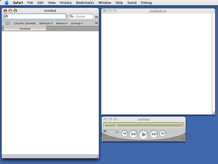
UNO 1.1: Minor Interface Glitches
(click for larger view)
Some caveats:
1) These theme installers do mess with essential system resources. And, while they do back up your original resource files, it's conceivable that something could go wrong and leave your system in an unusable state. Read the instructions carefully, and use with caution. Backup your OS if you want to be really safe. That said, I've never had a problem with apps like these.
2) There are a few little appearance glitches you might notice: A small white highlight in Safari tabs can be seem, and the rounded corners of Quicktime movies are replaced by pointy white ones. Also, the small, dark divider line between the title bar and the document, in windows without a toolbar (like plain text TextEdit windows), is absent. Otherwise, the themes look pretty good and remain consistent with the original OS. And any of these glitches is far less offensive to my eye than the visual affront that is Brushed Metal.
I started off using Iridium Hydroxide, now I'm using UNO. I'll probably switch back and forth for awhile, as I like them both. But I'll keep using these until Apple figures out how horrid Brushed Metal is, and gives us something better. Which may be any day now, if the latest versions of apps like iTunes and Mail are any indication.
Here's hoping.
Okay, don't have to, but really wanted to.
Anyway, back in the Panther days I hated metal so much, I actually began to delve into the arcane world of theming. All I ever really wanted, though, was to remove the "Brushed" part of Brushed Metal, and perhaps lighten the color a bit. This was fairly easy, and I did it with great success and to my great pleasure.
Theming is a drag, though, and by the time Tiger had come out, I'd had my fill. But the Brushed Metal theme persisted throughout the OS. And themes that hack the resources of the OS have largely fallen by the wayside in favor of solutions that take advantage of ShapeShifter. I prefer the latter method: ShapeShifter slows down my machines and costs money, and my needs are so simple. I just want Brushed Metal gone. So resource replacement, for me, is the way to go.
Fortunately, there are now a couple of packages out there that can do just that. One is called UNO, and it seeks to apply the Unified Interface look of apps like Mail (referred to in this excellent breakdown of OSX interface styles as "Smooth Metal") to the entire OS, and also flattens the Finder toolbar. If you like Unified, you'll probably like UNO. The other is called Iridium. Iridium does essentially what I talked about earlier: It takes the texture out of Brushed Metal, and lightens the remaining gray. It has less of a gradient in toolbars than UNO, and slightly less contrast, but is otherwise quite similar. Included with Iridium is a variant called Iridium Hydroxide, which is exactly like Iridium, except that it retains the original, glossy Finder toolbar. I like all of these themes. The differences between them are subtle, but the nice thing is that, with any of them, the UI sort of goes away after a bit -- disappears like a UI should. And yet, they actually look rather pretty. And certainly prettier than Brushed Metal.
UNO 1.1: Minor Interface Glitches
(click for larger view)
Some caveats:
1) These theme installers do mess with essential system resources. And, while they do back up your original resource files, it's conceivable that something could go wrong and leave your system in an unusable state. Read the instructions carefully, and use with caution. Backup your OS if you want to be really safe. That said, I've never had a problem with apps like these.
2) There are a few little appearance glitches you might notice: A small white highlight in Safari tabs can be seem, and the rounded corners of Quicktime movies are replaced by pointy white ones. Also, the small, dark divider line between the title bar and the document, in windows without a toolbar (like plain text TextEdit windows), is absent. Otherwise, the themes look pretty good and remain consistent with the original OS. And any of these glitches is far less offensive to my eye than the visual affront that is Brushed Metal.
I started off using Iridium Hydroxide, now I'm using UNO. I'll probably switch back and forth for awhile, as I like them both. But I'll keep using these until Apple figures out how horrid Brushed Metal is, and gives us something better. Which may be any day now, if the latest versions of apps like iTunes and Mail are any indication.
Here's hoping.
Labels: MacOSX
This entry was posted
on Sunday, October 02, 2005 at 2:43 PM.
You can skip to the end and leave a response.
![]()
![]()
5:41 AMI couldn't agree more! Brushed metal is as bad as the Cryptotellytubbyland that is Windows.
In fact, I started with Iridium Hydroxide too, and then moved to UNO. IrHO was nice, but the installer and frequent updates were a pain. Applying a replacement theme is something I wanted to do once, not weekly! UNO seems better presented, though there's not much to choose between the themes.
Problem is, I'm still waiting of something better. Where brushed metal is intrusive, UNO and Iridium are too monochromatic. Just a subtle tint would be fine, and it could be done on the fly by an installer, using Coreimage. Plus I haven't found a way to change Garageband's ugly theme.
Here's an essay on Apple's inconsistent application of its own HIG. He mentions the ‘somewhat childish look of both normal Aqua and brushed metal windows’.
If the default look can be called a theme, and is composed of images, then those images should be easily modifiable. And I'd love to change the color of the Apple logo in the upper left from ‘Graphite’ (slate) or ‘Blue’ (cobalt) to something else like black, burgundy, puce, hell whatever. Along with the close/maximize/minimize Skittles™. When I'd destroying my photographs, I don't want to be distracted by sweeties!
10:15 AM
I really do think that the unified appearance is so much nicer (thus all my messing with safari). I havent given Uno yet and am interested as to how it does play with the tab and bookmarks bar side of things in Safari, as I have just switched them off. I just worry about using an app that uniformly messes with all my apps.
There is an iTunes 5.0 theme for Shapeshifter but as I don't want to pay money to change the look of my OS then I will have to stick with playing with my nibs!!!!
7:32 PM
Hey guys,
Thanks for the legitimate comments. (I've been in Spam Hell.)
I've been poking around the issue of modifying the appearance of Mac OS X, and I've made some fairly interesting discoveries. I think I've found my solution, and it only requires modifying one file.
More in a post soon.
Now, back to work.
Cheers!
-systemsboy
» Post a Comment